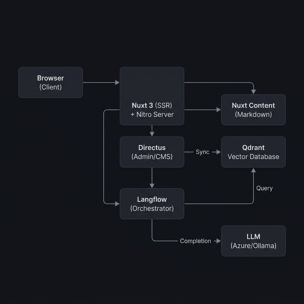
System Overview
Hub Digital follows a modern JAMstack-like architecture with server-side rendering, integrated with an AI-powered search and assistant layer orchestrated by Langflow:
Key Architectural Decisions
- Server-Side Rendering (SSR) — Pages are rendered on the server for SEO and initial load performance
- API Proxy — All Directus API calls go through Nuxt's Nitro server (
/api/proxy/) to handle auth and avoid CORS - Domain-Driven Modules — Features are organized into self-contained modules
- Shared Packages — Common code (types, utils, validation, i18n) is extracted into workspace packages
Monorepo Structure
hub-digital-ui/
├── apps/web/            # Main Nuxt 3 application
├── packages/
│   ├── i18n/            # Translation files (pt.json, en.json)
│   ├── logs/            # Logging utilities
│   ├── types/           # Shared TypeScript type definitions
│   ├── utils/           # Shared utility functions
│   └── validation/      # Shared validation schemas (Zod)
├── tooling/
│   ├── eslint/          # ESLint config preset
│   ├── tailwind-config/ # Tailwind CSS base theme
│   └── typescript/      # Shared tsconfig base
├── config.ts            # Global app configuration
├── turbo.json           # Turborepo pipeline
└── pnpm-workspace.yaml  # Workspace packages
Package Dependencies
web
├── types          (shared TypeScript types)
├── utils          (utility functions)
├── validation     (Zod schemas)
├── tsconfig       (TypeScript base config)
└── tailwind-config (Tailwind base theme)
     └── i18n      (translation files loaded at runtime)
Module Architecture
The web app uses a domain-driven module architecture under apps/web/modules/. Each module is self-contained and typically includes:
modules/<feature>/
├── components/     # Vue SFC components
├── composables/    # Reactive composition functions
├── constants.ts    # Static configuration values
└── types.ts        # Module-specific TypeScript types
Module Registry
| Module | Responsibility |
|---|---|
auth | Login, signup, password reset UI components |
account | Profile editing, security settings, invitations |
analytics | Analytics provider abstraction (Plausible, GA, etc.) |
catalog | Course/resource/tool listing, search, filtering |
dashboard | User dashboard, stats, achievements, leaderboard |
directus | Custom Nuxt module wrapping the Directus SDK |
marketing | Landing pages, blog, changelog, docs rendering |
shared | Cross-cutting components (search bar, icons, etc.) |
suggest-resource | Multi-step resource submission wizard |
suggest-tool | Multi-step tool submission wizard |
ui | shadcn-vue component library (buttons, forms, etc.) |
Auto-Import Configuration
All module paths are registered in nuxt.config.ts under imports.dirs (composables) and components (Vue components). This means you never need to manually import components or composables — they're globally available.
Data Flow
Client → Server → Directus
Vue Component
  └─▶ Pinia Store (action)
       └─▶ $directus.request(...)
            └─▶ Directus SDK (fetch)
                 └─▶ /api/proxy/[...] (Nitro handler)
                      └─▶ Directus REST API
- Components dispatch actions on Pinia stores
- Stores use the Directus SDK via
useNuxtApp().$directus - The SDK is configured to route requests through
/api/proxy/ - The proxy handler (
server/api/proxy/[...].ts) forwards requests to the Directus backend, managing headers and cookies
Authentication Flow
Login Form → authStore.login() → Directus SDK login
  → Proxy → Directus /auth/login
  → Tokens stored in cookies
  → authStore.fetchUser() → /users/me with fields
  → User data stored in Pinia state
The Directus module provides:
useDirectusAuth()— Login, logout, token refreshuseDirectusUser()— Current user data- Auth middleware — Route protection for authenticated pages
AI & Assistant Integration
The AI chat assistant (Toti) is integrated as a core architectural feature, bridging the user interface, custom backend endpoints, and vector search capabilities:
AI Data Flow
Vue Component (Chat UI)
  └─▶ useChat Composable / chatStore
       └─▶ /api/proxy/ai-chat (Nitro proxy)
            └─▶ Directus Custom Endpoint (/ai-chat)
                 └─▶ Langflow Orchestrator
                      ├─▶ Intent Router (JSON output)
                      ├─▶ Qdrant Vector DB (retrieval with filters)
                      └─▶ LLM API (Azure OpenAI / Ollama generation)
- Directus
/ai-chatEndpoint: A custom Node.js extension inhub-digital-adminthat forwards incoming queries to the Langflow orchestration flow. - Langflow Agent Orchestration: Langflow is used as the node-based visual orchestration framework to chain together intent classification, vector retrieval (Qdrant), web search APIs, and LLM prompting.
- Qdrant Vector Storage: Directus webhook operations (
qdrant-upsert-operation,qdrant-delete-operation) synchronize catalog data (courses, resources, tools, best practices, case studies, pedagogical methods) into Qdrant. The Langflow pipeline queries Qdrant to retrieve relevant items based on semantic similarity. - Intent Router: A fast LLM-based router configured within Langflow classifies the query into one of three execution paths:
- Clarification: Prompts the user for details when the query is ambiguous.
- Restricted: Internal Qdrant catalog lookup only (for courses and communities).
- Hybrid: Internal catalog lookup with optional search-based enrichment (for tools, resources, best practices, etc.).
- Large Language Model (LLM): Integrates with Azure OpenAI (production) or Ollama (local development) through Langflow nodes, using system prompt guidelines that strictly prioritize internal catalog references.
UI Component Library
The project uses shadcn-vue for its component library, installed at modules/ui/components/. Currently available components include:
accordion, alert, alert-dialog, avatar, badge, breadcrumb, button, card, carousel, checkbox, collapsible, combobox, dialog, dropdown-menu, form, hover-card, input, label, pagination, popover, progress, range-calendar, scroll-area, select, separator, sheet, star-rating, table, tabs, tags-input, textarea, toast, tooltip
Additionally, a set of custom AI chat components are available under modules/ui/components/ai-elements/.
Layouts
| Layout | File | Use Case |
|---|---|---|
marketing | layouts/marketing.vue | Public pages: home, blog, docs, legal |
auth | layouts/auth.vue | Authentication pages |
app | layouts/app.vue | Authenticated app pages |
catalog | layouts/catalog.vue | Catalog browsing |
default | layouts/default.vue | Fallback |
Content System
Static content is managed via Nuxt Content v3 with the following collections defined in content.config.ts:
| Collection | Source | Schema |
|---|---|---|
legal | content/legal/*.md | Standard SEO collection |
courses | content/catalog/courses/*.md | Name, description, instructors, etc. |
resources | content/catalog/resources/*.md | Title, description, license, tags |
tools | content/catalog/tools/*.md | Title, category, type, authors |
Documentation pages (like this one) use a custom rendering system in modules/marketing/content/ that supports:
- Multi-locale content (
.mdand.pt.mdfiles) - Hierarchical navigation via
meta.jsonfiles - Table of contents generation
- Markdown rendering with syntax highlighting